

BusPlus App - UX UI Case Study

Michelle LaPalme
BusPlus
“Knowing where you’re going is a must.”


I’m creating BusPlus to help improve the city bus system by increasing the quality of its overall experience. Most bus-goers rate their experience as average and report that arriving late is a major frustration. This app will help riders always stay in the know by allowing them to see how far away their bus is, catch the bus on time, and know how many stops they have before their bus reaches them.
WHY I CREATED THIS APP


Problem Statement
Transit officials have identified a problem that they want to solve. Due to expansion, numerous bus routes have been recently added. Many of those routes stop at the same bus stop. Before the new routes were added, riders could simply rush to the stop when they saw a bus coming—but that doesn't work anymore because it might not be the bus that they're expecting.
The city has developed a way to know how far away each bus is from a stop, but they aren't sure how to share that information with riders. Riders are currently complaining the most about the bus stop at Washington and State, which is served by seven bus lines.

How We Solved the Problem
Bus Riders Wanted to Know:
Where the bus is on the map
When the bus will arrive
How much time they have before walking to the bus stop
They are able to select a bus line and see future arrival times
MY DESIGN PROCESS:
I used the double-diamond design process when developing my Bus App. This design approach includes a Discover Phase - research and results, Define Phase - analysis of research, Develop Phase - designing and iterating, and Deliver Phase - usability testing and final product delivery.
DISCOVER PHASE
Competitive Analysis
I downloaded two apps and compared them using a SWOT analysis method. They are both direct competitors to my transportation app, BusPlus. Finding out what users struggled with gave me a keen insight into how I could improve upon my own product.

User Surveys
Affinity Mapping
Additional research from user surveys was compiled and categorized into groups that shared similarities, creating an affinity map. It displayed the most popular reasons behind the greatest advantages and disadvantages of riding the bus.
Research Results
After reviewing the results from user surveys and user interviews, it became clear what the needs and goals for bus riders were. Four of the most important things riders wanted to know were: where their bus was on the map, when the bus will arrive, how much time they had before walking to the bus stop, and they wanted to be able to select a bus line and see future arrival times.
Personas
From the initial research results, I created two personas to help me explore the needs of a larger user base while having target users in mind.
User Journey
Next, I created a user journey map to identify the pain points and feelings the user might go through while trying to catch the bus. I also listed potential solutions that could be developed in my bus app.
DEFINE PHASE
Now that I understand the user better, it’s time to converge and define the user stories, user flows and begin building our wireframes for the app.
User Stories
User Flow
In order to meet the user requirements outlined in the user stories, I created a flow diagram to ensure bus riders can reach their task goals in a simple and easy-to-understand way.
Wireframe Sketches
Once I had a user flow established, I could work on some sketches for the lo-fi wireframes of the bus app. The initial sketches feature a search bar navigation feature that allows users to search for bus stops, a menu that displays bus stops near them, and a map with buses and bus stop icons located close to them. There is also an icon of the user pinpointing them on the map via GPS.
Lo-fi Wireframes

I created lo-fi wireframes in Figma based off of my sketches to help me better visualize the direction my app was going in. After that was completed, it was time for some usability testing!
GETTING FEEDBACK
After the lo-fi wireframes were designed, I created a clickable prototype to test on a few users. I gave them a goal to accomplish - find out how to get to the Washington & State bus stop.
There were some problems that became noticeable once users tested the prototype. I compiled the results and worked to iterate and improve upon my bus app design.
WHAT WE NEEDED TO IMPROVE
DEVELOP PHASE
UI Design
The UI design followed a simple and easy-to-understand layout in order to help bus riders that were in a rush, so they would be able to understand the app while also having time to catch the bus. Choosing a sans serif font allowed users to scan quickly over the information they needed. As for the color palette, we were inspired by a vibrant orange to try and bring some delight to users who thought of the bus as a mundane experience.


Style Iterations
The logo went through several design iterations, we realized that having a logo that says Bus+ might just read as Bust. We couldn’t have that! After some thinking, we decided the best logo would be a combination of the words BusPlus and an icon of our bus underneath. We also explored some button ideas, coming up with a few that followed our emphasis on the color orange, which eventually became our call to action color.

DELIVER PHASE
Final Product
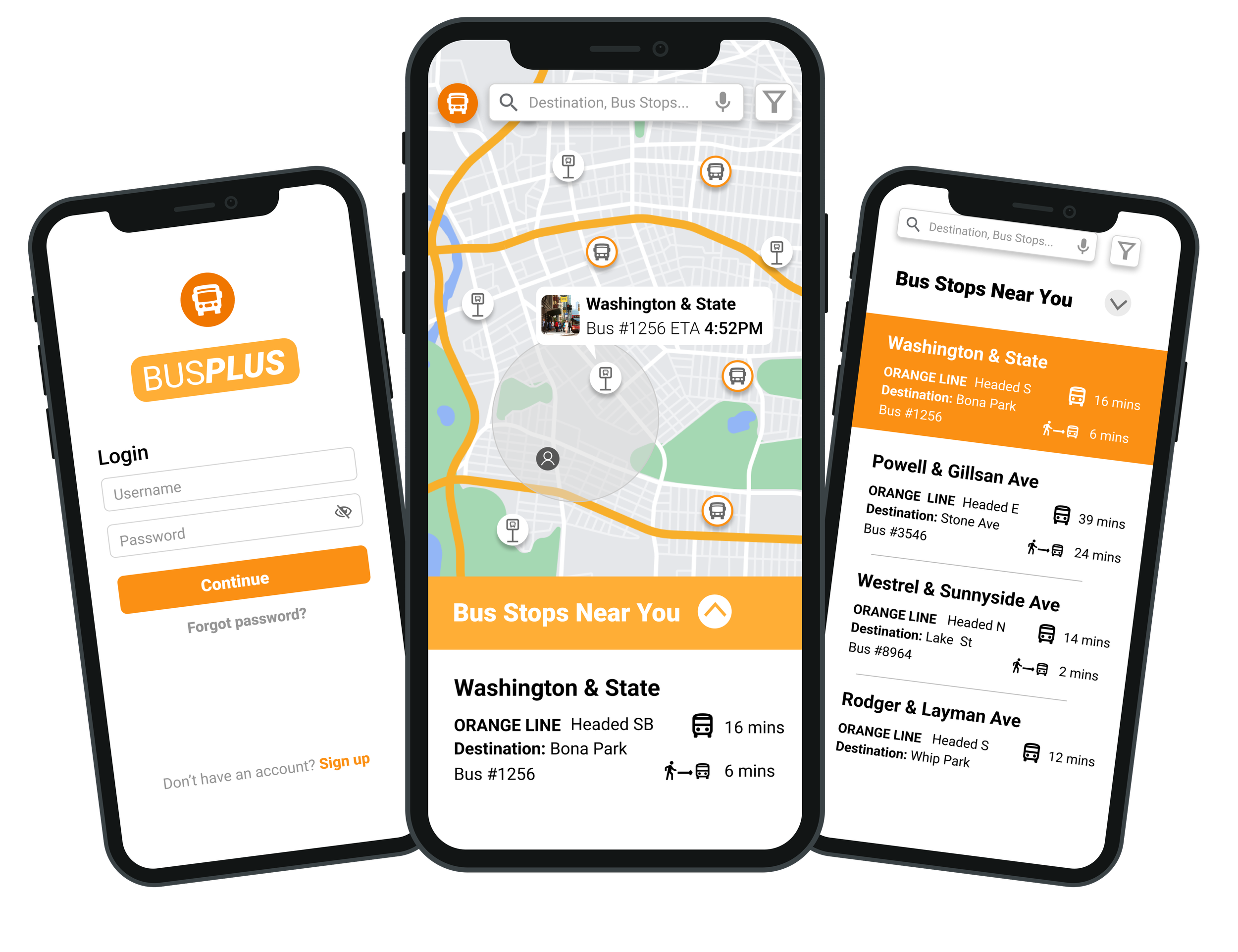
After creating the high-fidelity design for the bus app, I refined the clickable prototype, and did several more usability tests, which revealed some minor bugs and confusion among the users. I wanted to make sure catching the bus was as smooth as possible, so I fixed some areas - such as being able to save your password once you sign in, asking users if they would like a tour instead of needing help, and creating an extra screen for users who want to select the specific bus they are boarding while having directions available on screen.
Hi-fi Clickable Prototype
Project Summary
During this project, I learned how to evaluate a market analysis, complete user surveys, and understand research results. I was able to create a set of lo-fi designs and then iterate upon that by doing some usability testing. Finally, I was able to develop a high-fidelity clickable prototype as my end result, while also accruing insights into the UX UI process.
If I could do anything differently, it would be more research. I wish I had asked more questions along with some different questions to my candidates in the beginning to gain a better perspective of the pain points of bus riders. I also wished to have done a more in-depth branding analysis, but time was of the essence.
All in all, it was a great project to discover my love for UX UI design while also getting my feet wet in the process. There is a lot of room for improvement and I’m excited to continue this journey!

Thank you for reviewing the BusPlus app!
I really appreciate the time it took you to scroll this far!