

Michelle LaPalme
Cheryl Lee Creations - UX UI Design Sprint

Cheryl Lee Creations


I’ve created Cheryl Lee Creations to be an e-commerce mobile app with the goal of achieving a higher conversion rate than Cheryl’s online Etsy store. This app is a D2C business that sells carved candles, handmade soaps, and other artisanal items. We utilized Jake Knapp’s Design Sprint and created an MVP within a three-week period. KPI’s for success include: a shopper flow completion in a reduced number of taps (4-8), an increase of conversion rates to 11%, and customer satisfaction with at least 24 positive reviews all by January 2024.
WHY I CREATED THIS APP

Problem Statement
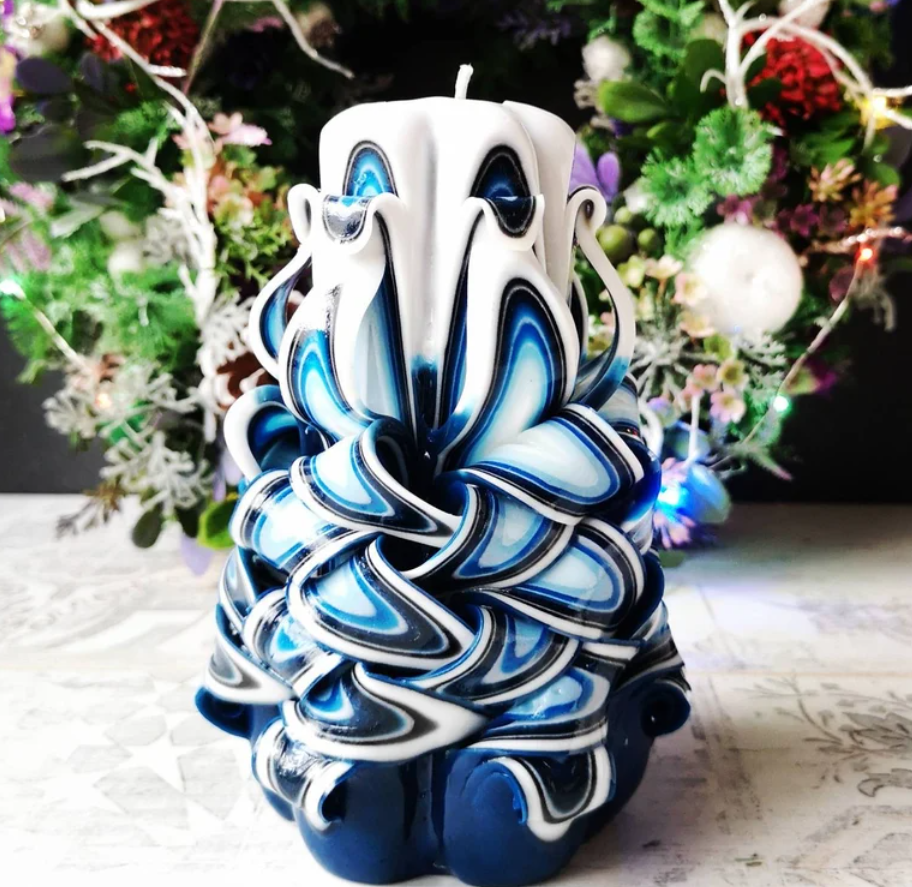
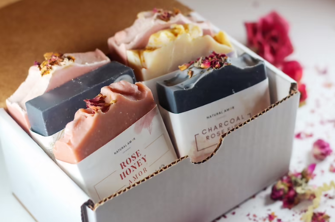
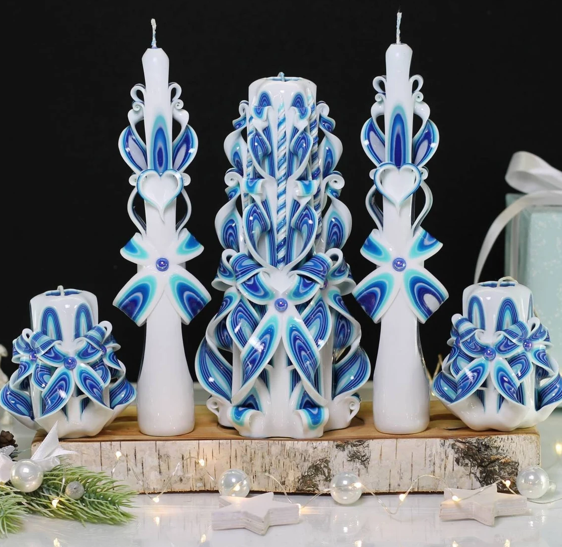
Our client, Cheryl Lee, currently runs an online Etsy store selling carved candles, handmade soaps, holiday products, and other artisanal crafts and items. The conversion rate for her Etsy store in 2022 was 7.8% with 1,148 total visits. Purchases were topped off at 90 orders.
Due to Etsy’s shipping costs and fees for sellers, Cheryl wants to build an e-commerce website for Cheryl Lee Creations in order to to cancel out the corporate middle-man, and truly be an independent small business, without having to rely on Etsy to bring in buyers.
How We Solved the Problem
Our target audience wants the e-commerce experience to:
be as simple and easy to understand as possible
not have too many features
have a quick shopper flow
feel a sense of trust while using the app
be intuitive so the user always knows where they are
Design Sprint Process:

In a traditional Design Sprint, you only have one week to build and test a prototype. However, my modified Design Sprint will be spread out across a three-week period. The first week will involve researching the user and sketching a solution, the second week will involve lo-fi wireframing, prototyping and testing, and the third week will be about presenting to stakeholders and implementing recommendations to improve our design solutions.
DESIGN SPRINT: WEEK 1
Researching the User and Sketching a Solution
According to Etsy analytics, their consumer base is:
86% female
between the ages of 18 - 35
17% of consumers have an annual income under $25,000
Around 40% of Etsy buyers are repeat customers. Around 60% will only make a one-time purchase
Target Audience Analysis
The air and culture of handmade, vintage, original designs, and bright color pallets are huge pulls for Etsy’s market audience. While this is by no means the ONLY audience on Etsy, top-rated and top-selling shops tend to gear toward this market.

At local craft shows, Cheryl Lee’s consumer base:
is 70% female
is between the ages of 18 - 40
values quality, reliability, transparency, and tradition
are usually stay-at-home moms or working class
likes to purchase from small business owners
wants to move away from the greed of large corporations

Competitive Analysis
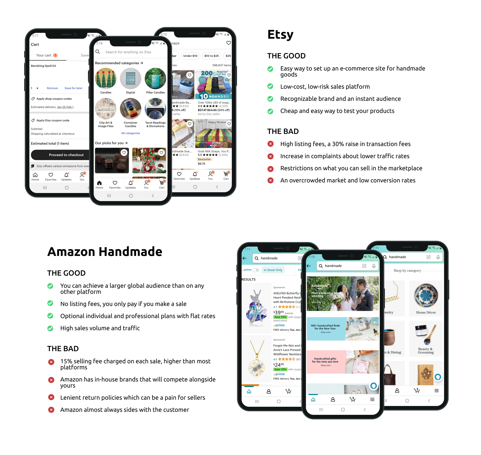
I downloaded and then analyzed two apps who are our direct competitors. I compared the layout of each app to see which features could be removed to reduce complexity on the screen while still having an MVP that satisfies the business’s requirements and user’s needs. I also found that users and sellers favor the trustworthiness of the brand enough that they will pay the extra fees associated with selling and buying.
How Might We…?
Why start off with How Might We statements? A HMW statement turns our challenge around by framing it into a question that can be solved. It turns the problem into an opportunity for generative thinking and organizes how we think about the problem and possible solutions. Our top three HMW statements we want to solve are given a thumbs-up.
Empathy Maps
After creating empathy maps, we gained a better insight into the thoughts and feelings of our customers. We learned that Jenny, our primary user persona, wanted discounts to be available for buying multiple of the same item. She also wants a shipping policy that allows for a full refund if the product breaks during transit.
Dean, our secondary persona, needs a gift option section, because he feels overwhelmed with the number of choices presented to him. These personas helped us to explore the needs of a larger group of users and to design our product with specific users in mind.
Storyboarding
I then created UX storyboards for our primary persona to help me visually predict and explore a user’s experience with our product.
The storyboards revealed more understanding toward the customer, who needed to have the shipping policies available to view before confirming a purchase. This helps to build trust with the user. We also added an Estimated Delivery time to our Product Page - this allows the user to gain more clarity about their product needs without having to go through an entire shopper flow.
Lastly, we added a Success! screen to give the customer a feeling of satisfaction and completion to the process of buying an item.
Journey Map
The user journey explores the path a customer may take when reaching their goal. It helped me identify the pain points and feelings the user might go through when ordering a product from our app, and lead me to pinpoint several areas that could be improved.
The user needs reassurance about buying on a small business app - to remedy this - we can have reviews readily available in a way that is easy for the user to find. There should also be a way to message the seller to build confidence in the user, so that they know they can talk to a person if they need to.
User Flow
I created a simple diagram of the main shopping flow. Our goal here is to find the best way for a user to purchase a product in as few clicks as possible without feeling insecure. We replicated a familiar shopping flow to put the user at ease, and found that five (5) taps was all that was needed for a successful completion of purchase.
Sketching Iterations


I began ideating with sketches, utilizing Jake Knapp’s Crazy 8’s method. There needed to be a way for the customer to see all the categories at once when first browsing the app. I sketched multiple variations to accommodate this idea.
I came up with the idea that users only have to pick between two options when first landing (a ‘Just Browse’ and a ‘Shop by Category’ option) on the app to lessen the cognitive load.

Final Sketch Solutions
For the final sketch solutions, I designed the landing page to start off with only to categories. By clicking the ‘Just Browse’ category, the user is taken to a screen displaying our best sellers. By clicking the ‘Shop by Category’ option, the user moves on to a screen that shows the six main categories of our products.
I included a discount message pop-up to ensure customers are aware of the discount alternative, along with a bag icon feature on our product list page to allows customers to quickly purchase an item.
A favorites section was also designed, to entice the user to return to products that they liked in the past, thus improving the conversion rate.
Paper Prototyping and Feedback
After several paper prototyping tests, it was revealed that everyone chose the ‘Shop by Category’ option when hitting the landing page, so I eliminated that screen to reduce the number of clicks.
I also changed the shopping bag icon on the product list page to ‘Add to Bag’ for less confusion (the shopping bag icon on the top right serves a different purpose and users were confused by the two of them).
The discount pop-up message was too annoying, and doesn’t necessarily guarantee people will see it unless they click ‘Add to Bag,’ so I nixed it in favor of a discount message displayed at the top with a question mark icon for users to click if they wanted more information.
Users also needed a pop-up confirmation when clicking ‘Add to Bag’ for additional clarity during the shopping flow. Different methods of payment such as Paypal and Venmo were added to build trust with customer who might not want to give their credit card details to a brand new app.
DESIGN SPRINT: WEEK 2
Wireframing, Prototyping, and Testing
Lo-fi Wireframes

I created lo-fi wireframes in Figma based off of my sketches to help me better visualize the direction my app was going in. After that was completed, it was time for some usability testing!
Lo-fi Prototype: Version 1
User Interviews


It was time to test our lo-fi prototype. I initially tested on five users, first by making a research plan where I outlined research goals, created questions to be asked, and developed a script with tasks to complete.
After collecting the insights from these participants, I sought out patterns in their behavior and frustrations while they were going through the prototype. I then proceeded to compile all this information into a presentation to show stakeholders. It was important that I showcase the recommendations I made to further solve our design problems.
DESIGN SPRINT: WEEK 3
Presenting to Stakeholders and Polishing Our Design Solutions
Getting & Giving Feedback
We needed to ask ourselves and our stakeholders what could be improved at this point. I created a presentation to showcase what was being built to our client, and this is the feedback I received. I needed to reduce the number of categories on the home page, so it would be less intimidating to users. I added a ‘Thank you for supporting small businesses!’ at the end of the shopper flow to let the customer know how much we appreciate them. Finally, I included a ‘More Reviews’ hyperlink below our featured reviews page, so users can dig deeper into what other customers are saying about the shop and the products. This will continue to build trust with the user.
Lo-fi Prototype: Version 2
I added the features suggested by my client and created another prototype to show how it would all work together.
Design Sprint Review
Looking Back. . .

What Did I Learn?
Over the course of three weeks, I learned how to run a design sprint, which was challenging and fun. Experience is the best teacher, and I wouldn’t have learned as much as I had without jumping in the deep end and just getting started! I also learned that there is no such thing as a perfect design, only well-executed design solutions. I also taught myself how to make informed decisions based off of heuristic evaluations, and how to creatively think in a fast-paced environment. I also noticed improvement in articulating my design decisions to stakeholders, which was a win all around!